캐글 커널 필사하기
EDA To Prediction (DieTanic) - Ashwini Swain
노트북 목차
파트1: 탐색적 데이터 분석(EDA)
1) 특성 분석
2) 여러 특성을 고려한 관계 또는 트렌드 찾기
파트2: Feature Engineering 및 데이터 정제
1) 새로운 특성 추가하기
2) 중복 특성 제거하기
3) 모델링에 적합한 형태로 특성 변환하기
파트3: 모델링 예측
1) 기본적인 알고리즘
2) 교차 검증
3) 앙상블 기법
4) 중요한 특징 추출
파트1: 탐색적 데이터 분석(EDA)
import numpy as np
import pandas as pd
import matplotlib.pyplot as plt
import seaborn as sns
plt.style.use('fivethirtyeight')
import warnings
warnings.filterwarnings('ignore')
%matplotlib inline

data = pd.read_csv('train.csv')
data.head()
PassengerId : 탑승객의 고유 아이디
Survival : 생존유무(0: 사망, 1: 생존)
Pclass : 선실의 등급
Name : 이름
Sex : 성별
Age : 나이
Sibsp : 함께 탑승한 형제자매, 아내 남편의 수
Parch: 함께 탑승한 부모, 자식의 수
Ticket: 티켓번호
Fare: 티켓의 요금
Cabin: 객실번호
Embarked: 배에 탑승한 위치(C = Cherbourg, Q = Queenstown, S = Southampton)
data.isnull().sum() # 결측치 개수 확인

얼마나 많이 살아남았는지 그래프를 통해 확인해보자.
f, ax = plt.subplots(1, 2, figsize=(10, 5))
data['Survived'].value_counts().plot.pie(explode=[0, 0.1], autopct='%1.1f%%', ax=ax[0], shadow=True)
ax[0].set_title('Survived')
ax[0].set_ylabel('')
sns.countplot('Survived', data=data, ax=ax[1])
ax[1].set_title('Survived')
plt.show()
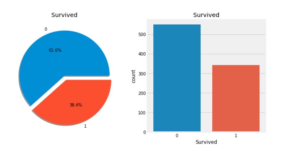
- 위의 그래프를 통해 훈련셋에 탑승한 891명 중 350명만이 생존하였음을 확인할 수 있다. 더 나아가 데이터에서 생존하지 못한 승객을 파악할 수 있는 많은 정보를 조사해야 한다. 이는 통찰력(Insight)을 얻기 위함이다.
- 데이터셋에서 서로 다른 특성들을 사용하여 생존율을 확인해보자. 이를 위해선 각 특성들을 이해해야 한다.
특성의 종류
1. 범주형 특성(Categorical Feature)
- 범주형 변수는 둘 이상의 범주가 있는 변수이며, 해당 특성의 각 값을 범주별로 분류할 수 있다. 예를 들어, 성별은 2가지 범주(남성, 여성)를 갖는 범주형 변수이다. 이러한 변수는 정렬하거나 순서를 지정할 수 없기 때문에 명목형 변수라고도 불린다.
- 타이타닉 데이터셋의 범주형 변수: Sex, Embarked.
2. 순서형 특성(Ordinal Features)
- 순서형 변수는 범주형 변수와 비슷하지만, 값 사이의 상대적인 정렬 혹은 정렬이 가능하다는 점에서 차이가 있다. 예를 들어, Tall, Medium, Short 값을 가진 Height와 같은 변수를 순서형 특성이라 한다.
- 타이타닉 데이터셋의 순서형 변수: PClass
3. 연속형 특성(Continous Feature)
- 두 지점 사이 혹은 최소값, 최대값 사이의 값을 사용할 수 있는 경우를 연속형 특성이라 한다.
- 타이타닉 데이터셋의 연속형 변수: Age
Sex -> Categorical Feature
data.groupby(['Sex', 'Survived'])['Survived'].count()

f, ax = plt.subplots(1, 2, figsize=(10, 5))
data[['Sex', 'Survived']].groupby(['Sex']).mean().plot.bar(ax=ax[0])
ax[0].set_title('Survived vs Sex')
sns.countplot('Sex', hue='Survived', data=data, ax=ax[1])
ax[1].set_title('Sex: Survived vs Dead')
plt.show()
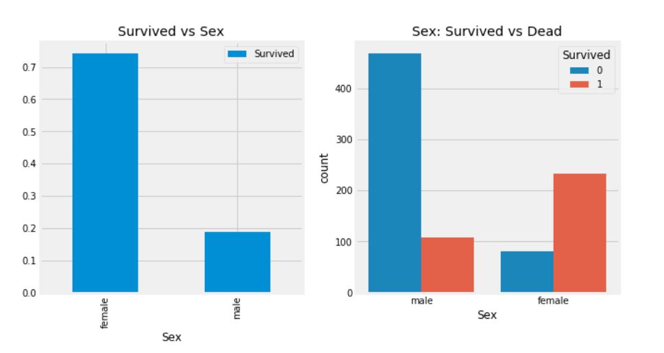
- 타이타닉 호의 승선한 남성의 수는 여성의 수보다 훨씬 많음에도 불구하고 여성의 생존율은 75%, 남성의 생존율은 약 18~19%임을 확인할 수 있다.
- 위의 결과를 보았을 때, 성별은 중요한 특성임을 파악할 수 있지만, 과연 이것만으로도 충분할까? 다른 특성도 확인해보자.
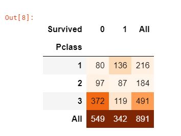
Pclass -> Ordinal Feature
pd.crosstab(data['Pclass'], data['Survived'], margins=True).style.background_gradient(cmap='Oranges')
f, ax = plt.subplots(1, 2, figsize=(10, 5))
data['Pclass'].value_counts().plot.bar(color=['#CD7F32', '#FFDF00', '#D3D3D3'], ax=ax[0])
ax[0].set_title('Number of Passengers By Pclass')
ax[0].set_ylabel('Count')
sns.countplot('Pclass', hue='Survived', data=data, ax=ax[1])
ax[1].set_title('Pclass: Survived vs Dead')
plt.show()
- Pclass 변수는 선실의 등급으로, 비행기 좌석의 클래스와 같은 개념이라고 생각하면 된다. Pclass 3의 승객 수가 가장 많지만 생존 비율을 확인했을 때, 구조 순서가 선실의 등급의 우선 순위가 부여되어 있음을 파악할 수 있다.
- Pclass 1의 생존율은 약 63%, Pclass 2의 생존율은 약 48%, Pclass 3의 생존율은 약 25%를 보이고 있다.
- 다른 특성들도 더 파악해보기 전에 Sex와 Pclass를 함께 살펴보자.
pd.crosstab([data['Sex'], data['Survived']], data['Pclass'], margins=True).style.background_gradient(cmap='Oranges')
sns.factorplot('Pclass', 'Survived', hue='Sex', data=data)
plt.show()
- FactorPlot을 사용하여 범주형 변수를 쉽게 분리할 수 있다.
- 위의 그래프를 통해 Pclass 1에서 94명의 여성 중 3명만이 사망한 것처럼 Pclass 1 여성의 생존율은 약 95~96%임을 파악할 수 있다.
- Pclass 1의 남성의 생존율이 낮은 것을 보아, 여성에게 최우선 구조 순위가 부여됨을 확인할 수 있다.
Age -> Continous Feature
print('가장 늙은 사람의 나이: {:.2f}'.format(data['Age'].max()), '세')
print('가장 어린 사람의 나이: {:.2f}'.format(data['Age'].min()), '세')
print('평균 나이: {:.2f}'.format(data['Age'].mean()), '세')

f, ax = plt.subplots(1, 2, figsize=(10, 5))
sns.violinplot('Pclass', 'Age', hue='Survived', data=data, split=True, ax=ax[0])
ax[0].set_title('Pclass and Age vs Survived')
ax[0].set_yticks(range(0, 110, 10))
sns.violinplot('Sex', 'Age', hue='Survived', data=data, split=True, ax=ax[1])
ax[1].set_title('Sex and Age vs Survived')
ax[1].set_yticks(range(0, 110, 10))
plt.show()
그래프를 통해 확인할 수 있는 점(Pclass와 Age의 생존율, Sex와 Age의 생존율)
- Pclass의 경우, 10세 미만의 어린이의 생존율이 양호해 보인다.
- Pclass1에서 20-50세의 승객의 생존율이 높고, 여성의 경우 남성보다 생존율이 더 높다.
- 남성의 경우 생존율은 나이가 증가할 수록 감소함을 보인다.
앞에서 살펴본 것처럼, Age의 특성은 177개의 결측치를 가지고 있다. NaN 값을 대체하기 위해선 데이터셋의 평균 나이로 할당할 수 있다.
하지만, 연령층이 높은 사람들이 꽤 많다는 것을 알 수 있다. 때문에 실제 4살의 아이를 평균 연령 29살로 할당하는 것은 바람직하지 않다. 그렇다면 어떻게 승객이 어떤 연령대인지를 확인할 수 있을까?
정답은 바로 이름에서 힌트를 얻을 수 있다. 이름에는 Mr. 또는 Mrs.와 같은 호칭이 붙어있기에 이 평균값을 각 그룹에 할당할 수 있다.
data['Initial'] = 0
for i in data:
    data['Initial'] = data['Name'].str.extract('([A-Za-z]+)\.')
위의 코드에서 정규표현식을 사용하여 이름의 A-Z 또는 a-z 사이에 있고, .(점)이 있는 문자열을 추출하는 것이다. 따라서 이름에서 호칭을 성공적으로 추출할 수 있다.
pd.crosstab(data['Initial'], data['Sex']).T.style.background_gradient(cmap='Oranges')
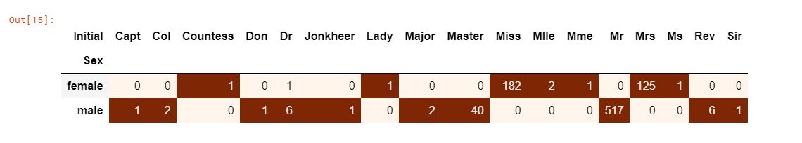
Mlle이나 Mme와 같은 맞춤법이 틀린 이니셜은 Miss를 의미하며, Dr의 경우 Mr로 변경할 수 있다.
data['Initial'].replace(['Mlle', 'Mme', 'Ms', 'Dr', 'Major', 'Lady', 'Countess', 'Jonkheer', 'Col', 'Rev', 'Capt', 'Sir', 'Don'],
                        ['Miss', 'Miss', 'Miss', 'Mr', 'Mr', 'Mrs', 'Mrs', 'Other', 'Other', 'Other', 'Mr', 'Mr', 'Mr'], inplace=True)
data.groupby('Initial')['Age'].mean()

Age의 결측치 채우기
data.loc[(data['Age'].isnull()) & (data['Initial'] == 'Mr'), 'Age'] = 33
data.loc[(data['Age'].isnull()) & (data['Initial'] == 'Mrs'), 'Age'] = 36
data.loc[(data['Age'].isnull()) & (data['Initial'] == 'Master'), 'Age'] = 5
data.loc[(data['Age'].isnull()) & (data['Initial'] == 'Miss'), 'Age'] = 22
data.loc[(data['Age'].isnull()) & (data['Initial'] == 'Other'), 'Age'] = 46

data['Age'].isnull().any()
f, ax = plt.subplots(1, 2, figsize=(10, 5))
data[data['Survived'] == 0]['Age'].plot.hist(ax=ax[0], bins=20, edgecolor='black', color='red')
ax[0].set_title('Survived = 0')
x1 = list(range(0, 85, 5))
ax[0].set_xticks(x1)
data[data['Survived'] == 1]['Age'].plot.hist(ax=ax[1], bins=20, edgecolor='black', color='green')
ax[1].set_title('Survived = 1')
x2 = list(range(0, 85, 5))
ax[1].set_xticks(x2)
plt.show()
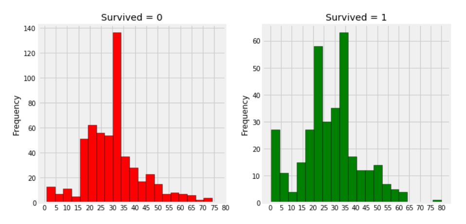
- 나이가 5살 미만인 유아들이 많이 생존했음을 확인할 수 있다.
- 가장 나이가 많은 80세의 승객이 구해졌다.
- 생존하지 못한 승객의 연령 그룹은 30-40세가 가장 많다.
sns.factorplot('Pclass', 'Survived', col='Initial', data=data)
plt.show()
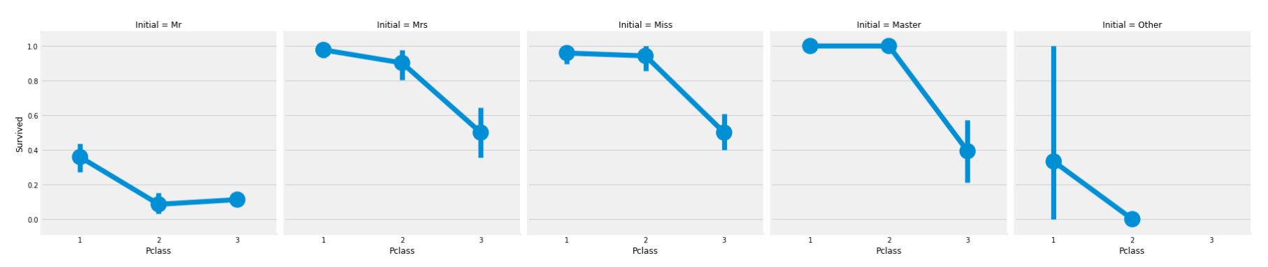
영화에서도 나왔듯이, 여성과 아이의 구조가 우선이라는 원칙이 그래프를 통해 입증할 수 있다.
Embarked -> Categorical Value
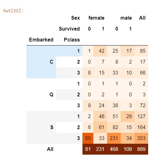
pd.crosstab([data['Embarked'], data['Pclass']], [data['Sex'], data['Survived']], margins=True).style.background_gradient(cmap='Oranges')
승선 항의 위치에 따른 생존율
sns.factorplot('Embarked', 'Survived', data=data)
fig = plt.gcf()
fig.set_size_inches(5, 3)
plt.show()
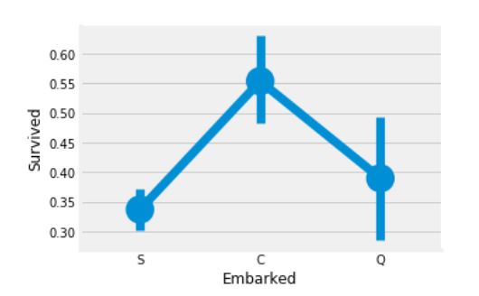
C(Cherbourg) 승선 위치에서의 생존율은 55%로 가장 높으며, S(Southampton) 승선 위치에서의 생존율은 가장 낮다.
f, ax = plt.subplots(2, 2, figsize=(10, 5))
sns.countplot('Embarked', data=data, ax=ax[0, 0])
ax[0, 0].set_title('No. Of Passengers Boarded')
sns.countplot('Embarked', hue='Sex', data=data, ax=ax[0, 1])
ax[0, 1].set_title('Male-Female Split for Embarked')
sns.countplot('Embarked', hue='Survived', data=data, ax=ax[1, 0])
ax[1, 0].set_title('Embarked vs Survived')
sns.countplot('Embarked', hue='Pclass', data=data, ax=ax[1, 1])
ax[1, 1].set_title('Embarked vs Pclass')

plt.subplots_adjust(wspace=0.2, hspace=0.5)
plt.show()
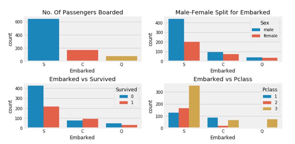
- S 승선 위치에서 온 대다수는 Pclass 3의 사람들이다.
- C 승선의 승객은 다른 위치에 비해 생존율이 높다. 아마도 Pclass 1의 비율이 높기 때문일 것이다.
- S 승선의 승객은 Pclass 3의 승객이 약 81%가 생존하지 못했기에 전체 생존율에서는 낮다.
- Q 승선의 승객은 95%가 Pclass 3의 사람들이다.
sns.factorplot('Pclass', 'Survived', hue='Sex', col='Embarked', data=data)
plt.show()
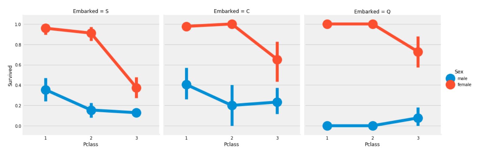
- Pclass와 상관없이 Pclass 1, Pclass 2의 여성의 생존 확률은 거의 1이다.
- S 승선의 승객들에서 Pclass 3의 승객들은 생존율이 매우 낮음을 볼 수 있다.
- Q 승선의 승객에서는 전체 남자들의 생존율이 매우 낮음을 볼 수 있다.
Embarked의 결측치 채우기
S 승선의 승객 수가 최대임을 보아, 결측치는 S로 대체하겠다.
data['Embarked'].fillna('S', inplace=True)
data['Embarked'].isnull().any()
SibSp -> Discrete Feature
이 특성은 가족 구성원 수를 나타내는 것이다.
- Sibling = 형제, 자매, 의붓형제, 이복 누이
- Spouse = 남편, 아내
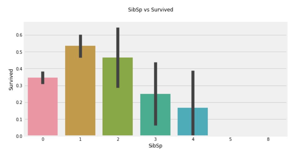
pd.crosstab(data['SibSp'], data['Survived']).style.background_gradient(cmap='Oranges')
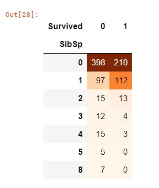
fig = plt.figure(figsize=(10, 5))
sns.barplot('SibSp', 'Survived', data=data)
fig.suptitle('SibSp vs Survived')

plt.close(2)
plt.show()
pd.crosstab(data['SibSp'], data['Pclass']).style.background_gradient(cmap='Oranges')
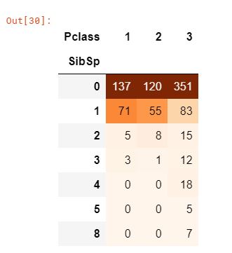
- 그래프를 통해 승객이 혼자 탑승한 경우 생존율이 34.5% 정도 되며, 형제 수가 증가할 수록 생존율이 줄어드는 것을 확인할 수 있다. 이는 말이 될 수 있는 것이, 가족이 있다면 나보다는 가족을 먼저 살리기 위해서 노력할 것이다.
- 놀라운 부분은 5-8인의 가족의 생존율은 0%이다. 이러한 이유는 무엇일까? 크로스탭으로 Pclass의 비율을 보면 형제 자매의 수가 3인을 초과하는 경우 모두 Pclass 3의 승객임을 알 수 있다. 즉, Pclass 3의 모든 대가족이 생존하지 못했다.
Parch
함께 탑승한 부모, 자식의 수
pd.crosstab(data['Parch'], data['Pclass']).style.background_gradient(cmap='Oranges')
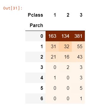
크로스탭으로 Parch를 확인해보면 Pclass 3일 수록 더 많은 수의 인원이 있음을 확인할 수 있다.
fig = plt.figure(figsize=(10, 5))
sns.barplot('Parch', 'Survived', data=data)
plt.suptitle('Parch vs Survived')
plt.close(2)
plt.show()
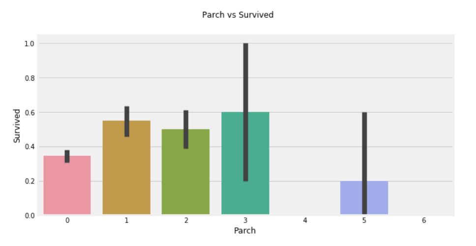
- 여기서도 결과가 비슷하다. 부모와 함께 탑승한 승객의 생존율이 더 높다. 그러나 숫자가 증가할 수록 생존율이 낮아진다.
- 1-3명의 부모가 있는 경우에 생존의 기회가 높아지지만, 혼자이거나 4명 이상의 부모가 있는 경우 생존율이 낮아진다.
Fare -> Continous Feature
print('가장 비싼 운임료: {:.2f}'.format(data['Fare'].max()))
print('가장 싼 운임료: {:.2f}'.format(data['Fare'].min()))
print('평균 운임료: {:.2f}'.format(data['Fare'].mean()))

f, ax = plt.subplots(1, 3, figsize=(10, 5))
sns.distplot(data[data['Pclass'] == 1]['Fare'], ax=ax[0])
ax[0].set_title('Fares in Pclass 1')
sns.distplot(data[data['Pclass'] == 2]['Fare'], ax=ax[1])
ax[1].set_title('Fares in Pclass 2')
sns.distplot(data[data['Pclass'] == 3]['Fare'], ax=ax[2])
ax[2].set_title('Fares in Pclass 3')

plt.show()
Pclass 1의 승객들의 운임료를 보면 큰 분포가 있는 것으로 보인다. 그리고 이 분포는 표준이 감소함에 따라 줄어드는 것을 확인할 수 있다. 이러한 이산형 데이터는 Binning 기법을 사용하여 불연속값으로 변환할 수 있다.
- Binning: 대표적인 변수 가공(Feature Engineering) 기법 중의 하나로 수치형 변수를 범주형 변수로 변형하는 작업.
- 예를 들어, 직원의 나이에 따라 청소년(<20), 청년(20<30), 청장년(30<55), 장년(55>=) 등으로 구분하는 작업이 binning 기법이다.
모든 특성에 대한 요약
-
Sex: 여성의 생존율이 남성에 비해 높음
-
Pclass: 1등석 승객이 더 생존율이 높음. 여성의 경우 1등석의 생존율은 거의 1이며, 2등석 역시 매우 높음.
-
Age: 5-10세 미만의 어린이는 생존율이 높음. 15-35세 그룹의 승객의 사망자 수가 높음.
-
Embarked: C 승선 위치에서의 생존율이 S 승선 위치에서의 1등석 승객의 생존율 보다 높은 것으로 보임. Q 승선 위치의 대다수 승객은 3등석임.
-
Parch + SibSp: 1-2명의 형제 자매, 배우자 또는 1-3명의 부모님이 있는 경우 혼자거나 대가족에 비해 생존율이 높음.
특성간의 상관관계
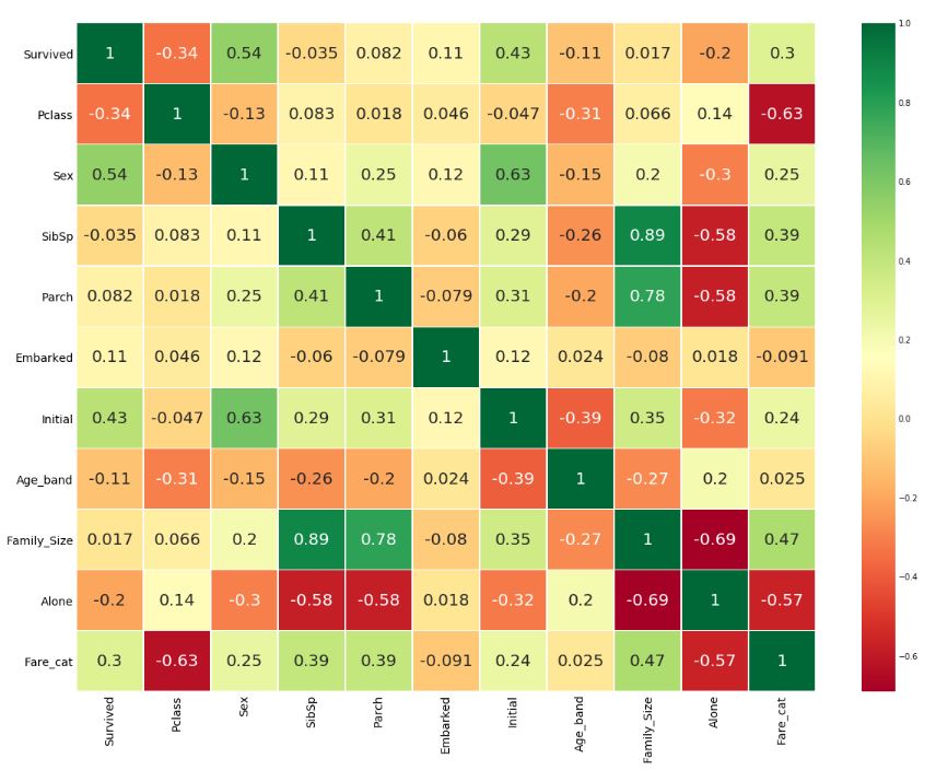
sns.heatmap(data.corr(), annot=True, cmap='RdYlGn', linewidths=0.2)
fig = plt.gcf()
fig.set_size_inches(10, 8)
plt.show()
히트맵 해석
- 양의 상관관계: 특성 A가 증가할 때, 특성 B도 증가한다면 양의 상관관계
- 음의 상관관계: 특성 A가 증가할 때, 특성 B가 감소한다면 음의 상관관계
만약 두개의 특성이 서로 상관관계가 있다면, 두 특성 모두 매우 유사한 정보를 포함하고 있다는 것을 의미한다. 이렇게 동일한 정보를 포함하는 특성이 많은 경우를 다중공선성이라 한다.
따라서 특성이 중복되므로 제거를 통해 모델링하거나 훈련하는 시간을 줄일 수 있다. 위의 히트맵에서는 다중공선성은 확인되지 않으며, 가장 높은 상관관계는 SibSp와 Parch라고 할 수 있다.
파트2: Feature Engineering 및 데이터 정제
Feature Engineering이란? 모든 특성이 데이터셋에서 중요하지는 않다. 제거해야 할 중복 특성이 많이 있을 수 있다. 또한, 다른 특성에서 정보를 추출하여 새로운 특성을 만들어 추가할 수도 있다. 이러한 과정을 Feature Engineering이라 한다.
Age_band
- Age의 특성이 가지고 있는 문제: Age는 연속형 변수로 머신러닝 모델에서 사용하기에 부적합하다. 만약 나이별로 그룹화를 하고자 한다면, 나이의 기준을 잡아서 범주형 변수로 변환하는 것이 옳을 것이다.
- Binning 기법 사용: 승객의 최대 연령은 80세이기 때문에 0-80에서 5 bin으로 범위를 나눈다. 따라서 80 / 5 = 16이 구간별 크기이다.
data['Age_band'] = 0
data.loc[data['Age']<=16, 'Age_band'] = 0
data.loc[(data['Age']>16) & (data['Age']<=32), 'Age_band'] = 1
data.loc[(data['Age']>32) & (data['Age']<=48), 'Age_band'] = 2
data.loc[(data['Age']>48) & (data['Age']<=64), 'Age_band'] = 3
data.loc[data['Age']>64, 'Age_band'] = 4

data['Age_band'].value_counts().to_frame().style.background_gradient(cmap='Oranges')
sns.factorplot('Age_band', 'Survived', data=data, col='Pclass')
plt.show()
Pclass와 상관없이 나이가 증가함에 따라 생존율이 감소함을 볼 수 있다.
Family_Size and Alone
새로운 특성인 ‘Family_Size’와 ‘Alone’을 추가하여 분석해보자. 이 특성들은 Parch와 SibSp 특성의 요약으로, 생존율이 승객의 가족 규모와 관련이 있는지 확인해볼 수 있는 데이터가 된다.
data['Family_Size'] = 0
data['Family_Size'] = data['Parch'] + data['SibSp']
data['Alone'] = 0
data.loc[data['Family_Size']==0, 'Alone'] = 1
f = plt.figure(figsize=(10, 5))
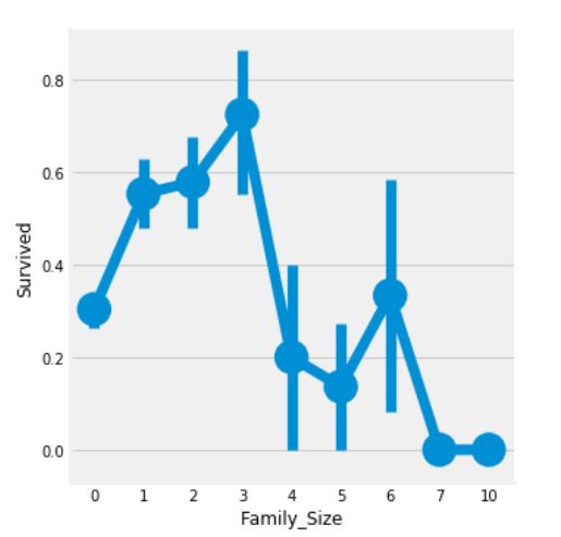
sns.factorplot('Family_Size', 'Survived', data=data)
f.suptitle('Family_Size vs Survived')
plt.show()
g = plt.figure(figsize=(10, 5))
sns.factorplot('Alone', 'Survived', data=data)
g.suptitle('Alone vs Survived')
plt.show()
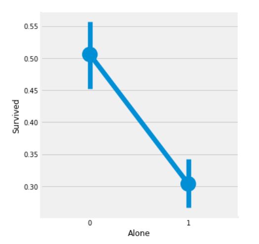
Family_Size가 0인 경우는 승객이 혼자임을 의미한다. 위의 그래프를 통해서 만약 승객이 혼자이거나 가족의 수가 0이라면, 생존율이 매우 낮음을 확인할 수 있다. 마찬가지로 가족의 수가 4보다 크면, 생존율도 낮아진다. 이러한 결과를 통해 Faimily_Size는 매우 중요한 특성이라고 할 수 있다.
sns.factorplot('Alone', 'Survived', data=data, hue='Sex', col='Pclass')
plt.show()
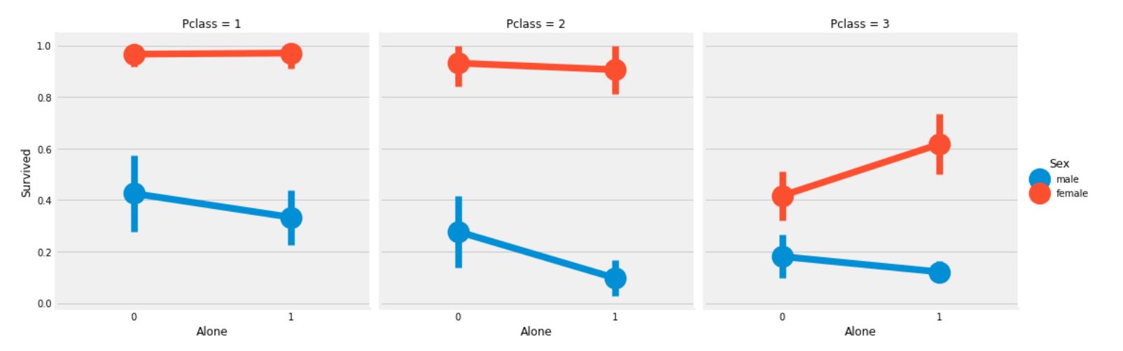
Pclass 3에서 여성 승객을 제외하고는 Sex와 Pclass와 상관없이 Alone인 경우에는 생존율이 낮아짐을 확인할 수 있다.
Fare_Range
운임료는 연속형 변수로, 순서형 변수로 변환해야 한다. 이를 위해 pandas에서 제공하는 qcut 메소드를 사용할 수 있다.
qcut는 bins의 값에 따라 분할하거나 정렬한다. 그래서 만약 5 bins로 설정하였다면, 5개의 구간 또는 범위에 동일한 간격으로 값이 정렬된다.
data['Fare_Range'] = pd.qcut(data['Fare'], 4)
data.groupby(['Fare_Range'])['Survived'].mean().to_frame().style.background_gradient(cmap='Oranges')
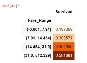
앞서 살펴본 결과들을 토대로, 운임료가 증가할 수록 생존율이 높아짐을 확인할 수 있다. 하지만 이제 Fare_Range의 값을 그대로 사용할 수 없기에, Age_Band와 같이 범주형 변수로 변환을 해야한다.
data['Fare_cat'] = 0
data.loc[data['Fare']<=7.91, 'Fare_cat'] = 0
data.loc[(data['Fare']>7.91) & (data['Fare']<=14.454), 'Fare_cat'] = 1
data.loc[(data['Fare']>14.454) & (data['Fare']<=31), 'Fare_cat'] = 2
data.loc[(data['Fare']>31) & (data['Fare']<=513), 'Fare_cat'] = 3

sns.factorplot('Fare_cat', 'Survived', data=data, hue='Sex')
plt.show()
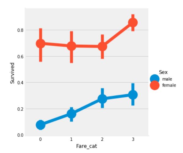
이로써 확실히 운임료가 증가할 수록, 생존율이 높아짐이 자명하다. 이는 Sex와 함께 모델링을 하는데 중요한 특성이 될 것이다.
문자열 변수를 수치형 변수로 변환
머신러닝 모델을 만들기 위해선, Sex, Embarked 등 문자열 변수를 수치형 변수로 변환을 해야만 한다.
data['Sex'].replace(['male','female'], [0,1], inplace=True)
data['Embarked'].replace(['S','C','Q'], [0,1,2], inplace=True)
data['Initial'].replace(['Mr','Mrs','Miss','Master','Other'], [0,1,2,3,4], inplace=True)

data.head()
필요없는 특성 제거하기
- Name -> 범주형 변수로 변환할 수 없기 때문에 제거
- Age -> Age_band 변수가 있기 때문에 제거
- Ticket -> 무작위로 생성되는 문자열 변수이므로 제거
- Fare -> Fare_cat 변수가 있기 때문에 제거
- Cabin -> 결측치가 많으며 많은 승객에는 여러 개의 객실이 있는 것은 당연하므로 제거
- Fare_Range -> Fare_cat 변수가 있기 때문에 제거
- PassengerId -> 범주형 변수로 변환할 수 없기 때문에 제거
data.drop(['Name', 'Age', 'Ticket', 'Fare', 'Cabin', 'Fare_Range', 'PassengerId'], axis=1, inplace=True)
sns.heatmap(data.corr(), annot=True, cmap='RdYlGn', linewidths=0.2, annot_kws={'size':20})
fig=plt.gcf()
fig.set_size_inches(18, 15)
plt.xticks(fontsize=14)
plt.yticks(fontsize=14)
plt.show()
위의 상관관계에 대한 히트맵을 보았을 때, SibSp와 Family_Size, Parch와 Family_Size간의 양의 상관관계를 볼 수 있고, Alone과 Family_Size간의 음의 상관관계를 확인할 수 있다.
파트3: 모델링 예측
우리는 EDA에서 데이터에 대한 통찰력을 얻었다. 그러나 아직까지는 승객의 생존율을 정확하게 예측할 수는 없다. 이제 머신러닝의 분류 알고리즘을 사용하여 승객의 생존율을 예측해보자.
1)Logistic Regression
2)Support Vector Machines(Linear and radial)
3)Random Forest
4)K-Nearest Neighbours
5)Naive Bayes
6)Decision Tree
from sklearn.linear_model import LogisticRegression
from sklearn import svm
from sklearn.ensemble import RandomForestClassifier
from sklearn.neighbors import KNeighborsClassifier
from sklearn.naive_bayes import GaussianNB
from sklearn.tree import DecisionTreeClassifier
from sklearn.model_selection import train_test_split
from sklearn import metrics
from sklearn.metrics import confusion_matrix

train, test = train_test_split(data, test_size=0.3, random_state=0, stratify=data['Survived'])
train_X = train[train.columns[1:]]
train_Y = train[train.columns[:1]]
test_X = test[test.columns[1:]]
test_Y = test[test.columns[:1]]

X = data[data.columns[1:]]
Y = data['Survived']
rbf-SVM
model = svm.SVC(kernel='rbf', C=1, gamma=0.1)
model.fit(train_X, train_Y)

prediction1 = model.predict(test_X)
print('Accuracy for rbf-SVM is {}'.format(metrics.accuracy_score(prediction1, test_Y)))

linear-SVM
model = svm.SVC(kernel='linear', C=0.1, gamma=0.1)
model.fit(train_X, train_Y)

prediction2 = model.predict(test_X)
print('Accuracy for linear-SVM is {}'.format(metrics.accuracy_score(prediction2, test_Y)))

Logistic Regression
model = LogisticRegression()
model.fit(train_X, train_Y)

prediction3 = model.predict(test_X)
print('Accuracy for Logistic Regression is {}'.format(metrics.accuracy_score(prediction3, test_Y)))

Decision Tree
model = DecisionTreeClassifier()
model.fit(train_X, train_Y)

prediction4 = model.predict(test_X)
print('Accuracy for Decision Tree is {}'.format(metrics.accuracy_score(prediction4, test_Y)))

K-Nearest Neighbors
model = KNeighborsClassifier()
model.fit(train_X, train_Y)

prediction5 = model.predict(test_X)
print('Accuracy for KNN is {}'.format(metrics.accuracy_score(prediction5, test_Y)))

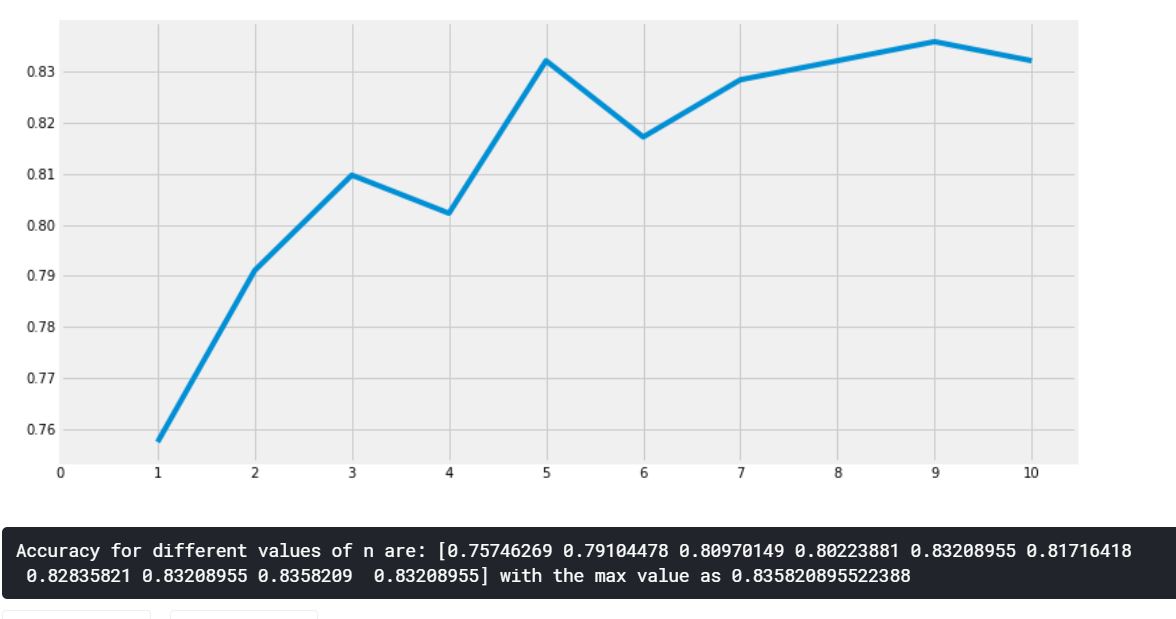
K-Nearest Neighbors 알고리즘은 n_neighbors 속성에 따라 값이 변하기 때문에 다른 값들도 확인해보자.
a_index = list(range(1, 11))
a = pd.Series()
x = np.arange(11)

for i in a_index:
    model = KNeighborsClassifier(n_neighbors=i)
    model.fit(train_X, train_Y)

    prediction = model.predict(test_X)
    a = a.append(pd.Series(metrics.accuracy_score(prediction, test_Y)))

plt.plot(a_index, a)
plt.xticks(x)
fig = plt.gcf()
fig.set_size_inches(12, 6)
plt.show()

print('Accuracy for different values of n are: {} with the max value as {}'.format(a.values, a.values.max()))
Gaussian Naive Bayes
model = GaussianNB()
model.fit(train_X, train_Y)

prediction6 = model.predict(test_X)
print('Accuracy for NaiveBayes is {}'.format(metrics.accuracy_score(prediction6, test_Y)))

Random Forest
model = RandomForestClassifier(n_estimators=100)
model.fit(train_X, train_Y)

prediction7 = model.predict(test_X)
print('Accuracy for Random Forest is {}'.format(metrics.accuracy_score(prediction7, test_Y)))

모델의 정확성이 분류의 척도를 결정하는 유일한 요인은 아니다. 또한, 테스트셋이 변경되면 정확도도 변경된다. 이를 극복하고 일반화된 모델을 얻기 위해 교차 검증(Cross Validation)을 사용한다.
교차 검증
K-Fold Cross Valildation
- 데이터셋을 k-subset으로 나눈다.
- 만약 k=5로 설정한다면, 테스트를 위한 1개의 파트를 예약하고, 나머지 4개의 파트는 훈련을 위해 사용한다.
- 각 반복에서 테스트 파트를 변경하고 다른 파트에 대해 알고리즘을 훈련시켜 프로세스를 반복한다. 그런 다음 정확도와 오차의 평균을 구하여 알고리즘의 평균 정확도를 얻는다.
- 알고리즘은 일부 훈련셋을 위한 데이터셋에 과소적합할 수 있고, 때때로 다른 데이터셋에는 과대적합이 될 수 있다. 그러므로 교차 검증을 통해 일반화된 모델을 얻을 수 있다.
from sklearn.model_selection import KFold, cross_val_score, cross_val_predict
kfold = KFold(n_splits=10, random_state=22)
mean = []
acc = []
std = []
classifiers = ['Linear SVM', 'Radial SVM', 'Logistic Regression', 'KNN', 'Decision Tree', 'Navie Bayes', 'Random Forest']
models = [svm.SVC(kernel='linear'), svm.SVC(kernel='rbf'), LogisticRegression(), KNeighborsClassifier(n_neighbors=9), DecisionTreeClassifier(), GaussianNB(), RandomForestClassifier(n_estimators=100)]
for i in models:
model = i
cv_result = cross_val_score(model, X, Y, cv=kfold, scoring='accuracy')
mean.append(cv_result.mean())
std.append(cv_result.std())
acc.append(cv_result)
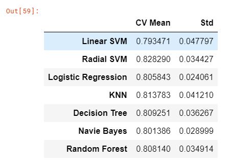
new_models_dataframe = pd.DataFrame({'CV Mean': mean, 'Std': std}, index=classifiers)
new_models_dataframe
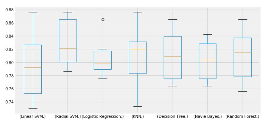
plt.subplots(figsize=(10, 5))
box = pd.DataFrame(acc, index=[classifiers])
box.T.boxplot()
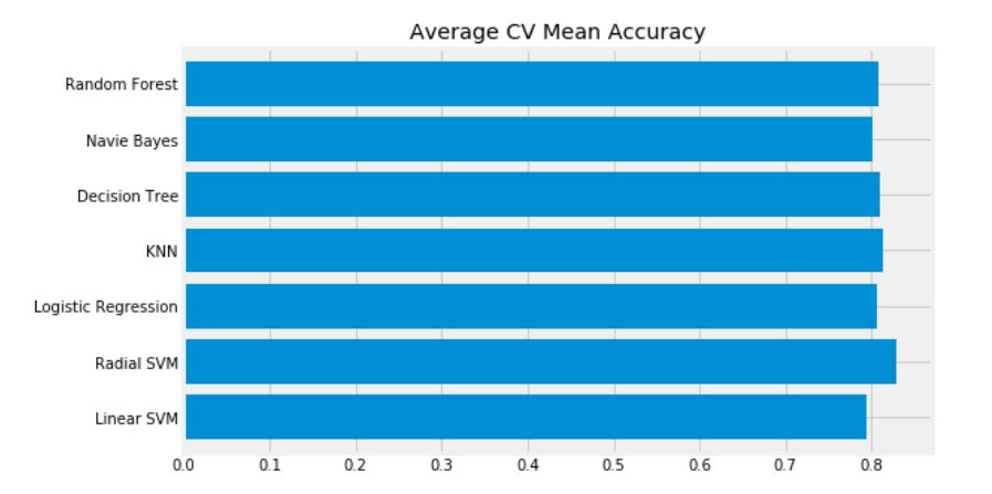
new_models_dataframe['CV Mean'].plot.barh(width=0.8)
plt.title('Average CV Mean Accuracy')
fig = plt.gcf()
fig.set_size_inches(8, 5)
plt.show()
데이터셋의 분균형으로 인해 분류 정확도가 잘못될 수 있다. 오차 행렬(Confusion Matrix)은 모델이 어디서 잘못되었는지 혹은 잘못 예측한 클래스가 어디인지를 확인할 수 있다.
오차 행렬(Confusion Matrix)
f, ax = plt.subplots(3, 3, figsize=(10, 8))

y_pred = cross_val_predict(svm.SVC(kernel='rbf'), X, Y, cv=10)
sns.heatmap(confusion_matrix(Y, y_pred), ax=ax[0, 0], annot=True, fmt='2.0f')
ax[0, 0].set_title('Matrix for rbf-SVM')

y_pred = cross_val_predict(svm.SVC(kernel='linear'), X, Y, cv=10)
sns.heatmap(confusion_matrix(Y, y_pred), ax=ax[0, 1], annot=True, fmt='2.0f')
ax[0, 1].set_title('Matrix for linear-SVM')

y_pred = cross_val_predict(KNeighborsClassifier(n_neighbors=9), X, Y, cv=10)
sns.heatmap(confusion_matrix(Y, y_pred), ax=ax[0, 2], annot=True, fmt='2.0f')
ax[0, 2].set_title('Matrix for KNN')

y_pred = cross_val_predict(RandomForestClassifier(n_estimators=100), X, Y, cv=10)
sns.heatmap(confusion_matrix(Y, y_pred), ax=ax[1, 0], annot=True, fmt='2.0f')
ax[1, 0].set_title('Matrix for Random Forest')

y_pred = cross_val_predict(LogisticRegression(), X, Y, cv=10)
sns.heatmap(confusion_matrix(Y, y_pred), ax=ax[1, 1], annot=True, fmt='2.0f')
ax[1, 1].set_title('Matrix for Logistic Regression')

y_pred = cross_val_predict(DecisionTreeClassifier(), X, Y, cv=10)
sns.heatmap(confusion_matrix(Y, y_pred), ax=ax[1, 2], annot=True, fmt='2.0f')
ax[1, 2].set_title('Matrix for Decision Tree')

y_pred = cross_val_predict(GaussianNB(), X, Y, cv=10)
sns.heatmap(confusion_matrix(Y, y_pred), ax=ax[2, 0], annot=True, fmt='2.0f')
ax[2, 0].set_title('Matrix for Naive Bayes')

plt.subplots_adjust(hspace=0.5, wspace=0.2)
plt.show()
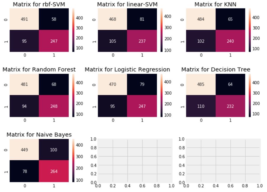
- 왼쪽 대각행렬은 각 클래스에 대한 올바른 예측 수를 나타내고, 오른쪽 대각행렬은 잘못된 예측 수를 나타낸다.
- rbf-SVM은 사망한 승객을 정확하게 예측했지만, Naive-Bayes는 생존한 승객을 정확하게 예측했다.
Hyper-Parameter Tuning
각 모델마다 설정할 수 있는 파라미터 값이 있는데 이 값들을 조정할 때마다 모델의 성능이 바뀐다. 이를 조정하는 것이 hyper-parameter tuning이라 한다.
가장 잘 분류된 SVM과 RandomForest 모델만 하이퍼파라미터 조정을 해보자.
SVM
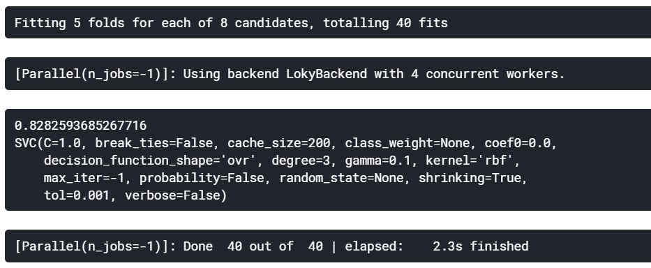
from sklearn.model_selection import RandomizedSearchCV

C = np.arange(0.5, 1.5, 0.5)
gamma = np.arange(0.1, 2.0, 1.0)
kernel = ['rbf', 'linear']

hyper = {'kernel': kernel, 'C': C, 'gamma': gamma}

rand_search = RandomizedSearchCV(estimator=svm.SVC(), param_distributions=hyper, verbose=True, n_jobs=-1)
rand_search.fit(X, Y)

print(rand_search.best_score_)
print(rand_search.best_estimator_)
Random Forest
n_estimators = range(100, 1000, 100)

hyper = {'n_estimators': n_estimators}

rand_search = RandomizedSearchCV(estimator=RandomForestClassifier(random_state=0), param_distributions=hyper, verbose=True, n_jobs=-1)
rand_search.fit(X, Y)

print(rand_search.best_score_)
print(rand_search.best_estimator_)
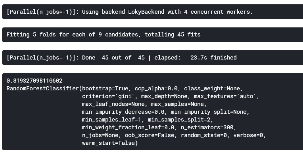
rbf-SVM의 최고 점수는 C=1.0, gamma=0.1인 82.82%를 획득하였고, Random Forest의 최고 점수는 n_estimators=300으로 81.9%를 획득하였다.
앙상블 기법(Ensembling)
앙상블 기법은 모델의 정확도와 성능을 높이기 위한 좋은 방법이다. 간단히 설명하자면, 다양한 모델들을 결합하여 하나의 강력한 모델을 만드는 방법이다.
1) Voting Classifier
2) Bagging
3) Boosting
Voting Classifier
투표 기반 분류기는 2가지 방식이 있다.
- Hard Voting Classifier: 여러 모델을 생성하고 그 결과를 비교한다. 이 결고들을 집계하여 가장 많은 표를 얻은 클래스를 최종 예측값으로 정하는 방식이다.
- Soft Voting Classifier: 앙상블에 사용되는 모든 뷴류기가 클래스의 확률을 예측할 수 있을 때 사용한다. 각 분류기의 예측을 평균 내어 확률이 가장 높은 클래스로 예측하는 방식이다(확률).
from sklearn.ensemble import VotingClassifier

ensemble = VotingClassifier(estimators=[('KNN', KNeighborsClassifier(n_neighbors=10)),
                                        ('RBF', svm.SVC(probability=True, kernel='rbf', C=1.0, gamma=0.1)),
                                        ('Lin', svm.SVC(probability=True, kernel='linear')),
                                        ('RFor', RandomForestClassifier(n_estimators=300, random_state=0)),
                                        ('LR', LogisticRegression(C=0.05)),
                                        ('DT', DecisionTreeClassifier(random_state=0)),
                                        ('NB', GaussianNB())], voting='soft').fit(train_X, train_Y)

print('Accuracy for ensembled model is {}'.format(ensemble.score(test_X, test_Y)))
print('Cross Validated score for ensembled model is {}'.format(cross_val_score(ensemble, X, Y, cv=10, scoring='accuracy').mean()))

Bagging
- 배깅은 샘플을 여러 번 뽑아 각 모델을 학습시켜 결과를 집계하는 방법이다. 대부분의 알고리즘의 학습에서는 높은 bias로 인한 과소적합과 높은 variance로 인한 과대적합이 나타나는 오류가 생긴다.
- 이러한 오류들을 줄이고, 알고리즘의 안정성과 정확성을 향상시키기 위해 표본을 추출하고 그 표본으로부터 평균을 추정하여 전체의 분포를 예측한다.
KNeighbors, DecisionTree, RandomForest
Bagged KNN
from sklearn.ensemble import BaggingClassifier

model = BaggingClassifier(base_estimator=KNeighborsClassifier(n_neighbors=3), random_state=0, n_estimators=700)
model.fit(train_X, train_Y)
prediction = model.predict(test_X)

print('Accuracy for bagged KNN is {}'.format(metrics.accuracy_score(prediction, test_Y)))
print('Cross Validated score for bagged KNN is {}'.format(cross_val_score(model, X, Y, cv=10, scoring='accuracy').mean()))

Bagged DecisionTree
model = BaggingClassifier(base_estimator=DecisionTreeClassifier(), random_state=0, n_estimators=100)
model.fit(train_X, train_Y)
prediction = model.predict(test_X)

print('Accuracy for bagged Decision Tree is {}'.format(metrics.accuracy_score(prediction, test_Y)))
print('Cross Validated score for bagged Decision Tree is {}'.format(cross_val_score(model, X, Y, cv=10, scoring='accuracy').mean()))

Boosting
- 부스팅은 뷴류기의 순차적 학습을 사용하여 약한 성능의 모델을 단계별로 향상시키는 방법이다. 배깅이 일반적인 모델을 만드는데 집중되어 있다면, 부스팅은 맞추기 어려운 문제를 맞추는 데 초점이 되어있다.
- 모델은 먼저 전체 데이터셋에 대해 학습한다. 틀리게 분류한 클래스에 대해 높은 가중치를 부여하고, 바르게 분류한 클래스에 대해 낮은 가중치를 부여한다.
- 다음 반복에서 학습되는 모델은 앞에서 설정된 가중치에 따라 다시 분류를 한다. 이를 단계적으로 학습하여 정확도를 높여준다.
AdaBoost, XGBoost, GradientBoost, LightGBM
AdaBoost(Adaptive Boosting)
from sklearn.ensemble import AdaBoostClassifier

ada = AdaBoostClassifier(n_estimators=200, random_state=0, learning_rate=0.1)

print('Cross Validated score for AdaBoost is {}'.format(cross_val_score(ada, X, Y, cv=10, scoring='accuracy').mean()))

Stochatic Gradient Boosting
from sklearn.ensemble import GradientBoostingClassifier

grad = GradientBoostingClassifier(n_estimators=500, random_state=0, learning_rate=0.1)

print('Cross Validated score for Gradient Boosting is {}'.format(cross_val_score(grad, X, Y, cv=10, scoring='accuracy').mean()))

XGBoost
import xgboost as xg

xgboost = xg.XGBClassifier(n_estimators=900, learning_rate=0.1)

print('Cross Validated score for XGBoost is {}'.format(cross_val_score(xgboost, X, Y, cv=10, scoring='accuracy').mean()))

LightGBM
import lightgbm as lgb

lgb = lgb.LGBMClassifier(n_estimators=900, learning_rate=0.1)

print('Cross Validated score for LightGBM is {}'.format(cross_val_score(lgb, X, Y, cv=10, scoring='accuracy').mean()))

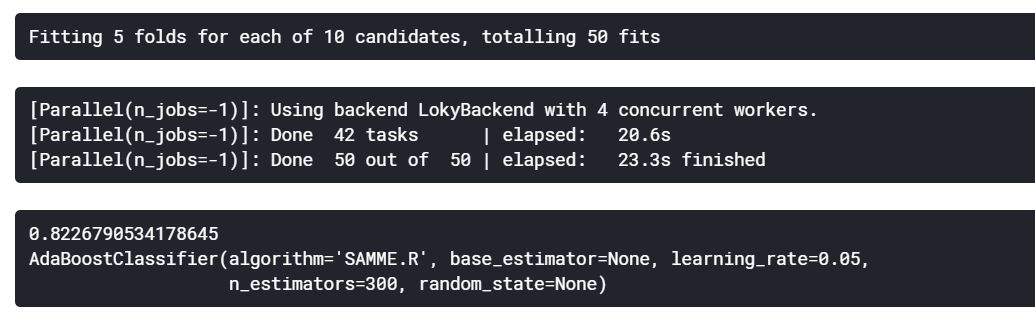
가장 정확도가 높은 모델은 AdaBoost이다. 하이퍼파라미터 튜닝을 해보자.
n_estimators = list(range(100, 1100, 100))
learning_rate = np.arange(0.05, 1.05, 0.05)

hyper = {'n_estimators': n_estimators, 'learning_rate': learning_rate}

rand_search = RandomizedSearchCV(estimator=AdaBoostClassifier(), param_distributions=hyper, verbose=True, n_jobs=-1)
rand_search.fit(X, Y)

print(rand_search.best_score_)
print(rand_search.best_estimator_)
from sklearn.model_selection import GridSearchCV

gd = GridSearchCV(estimator=AdaBoostClassifier(), param_grid=hyper, verbose=True, n_jobs=-1)
gd.fit(X, Y)

print(gd.best_score_)
print(gd.best_estimator_)
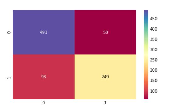
가장 좋은 모델의 오차 행렬
ada = gd.best_estimator_
result = cross_val_predict(ada, X, Y, cv=10)

sns.heatmap(confusion_matrix(Y, result), cmap='Spectral', annot=True, fmt='2.0f')
plt.show()
중요한 특징 추출
f, ax = plt.subplots(2, 2, figsize=(12, 10))

model = RandomForestClassifier(n_estimators=500, random_state=0)
model.fit(X, Y)
pd.Series(model.feature_importances_, X.columns).sort_values(ascending=True).plot.barh(width=0.8, ax=ax[0, 0], cmap='autumn')
ax[0, 0].set_title('Feature Importance in Random Forest')

model = AdaBoostClassifier(n_estimators=200, learning_rate=0.05, random_state=0)
model.fit(X, Y)
pd.Series(model.feature_importances_, X.columns).sort_values(ascending=True).plot.barh(width=0.8, ax=ax[0, 1], cmap='Wistia')
ax[0, 1].set_title('Feature Importance in AdaBoost')

model = GradientBoostingClassifier(n_estimators=900, learning_rate=0.1, random_state=0)
model.fit(X, Y)
pd.Series(model.feature_importances_, X.columns).sort_values(ascending=True).plot.barh(width=0.8, ax=ax[1, 0], cmap='summer')
ax[1, 0].set_title('Feature Importance in Gradient Boosting')

model = xg.XGBClassifier(n_estimators=900, learning_rate=0.1)
model.fit(X, Y)
pd.Series(model.feature_importances_, X.columns).sort_values(ascending=True).plot.barh(width=0.8, ax=ax[1, 1], cmap='winter')
ax[1, 1].set_title('Feature Importance in XGBoost')

plt.show()
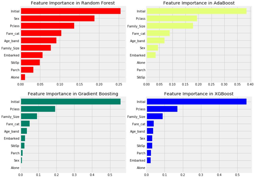
- 일반적인 중요한 특성은 Initial, Pclass, Fare_cat, Family_Size로 확인된다.
- 앞에서 Pclass와 결합된 Sex 특성이 좋았던 것에 비해, 이 그래프를 통해 Sex는 중요하지 않아 보인다. 즉, Sex 특성은 RandomForest에서만 중요한 특성인 것 같다.
- Initial은 앞서 Sex와의 상관관계를 보았으므로 성별을 나타내는 중요한 특성이다.
- Pclass 및 Fare_cat은 Alone, Parch, SibSp를 가진 승객 및 Family_Size의 상태를 나타낸다.
최적의 모델 결과 제출
data2 = pd.read_csv('C:/Users/battl/PycharmProjects/cse_project/coding practice/Kaggle/Titanic/test.csv')

test_Survived = pd.Series(result, name='Survived')
IDtest = data2['PassengerId']

result_dataframe = pd.concat([IDtest, test_Survived], axis=1)
result_dataframe.to_csv('EDA to prediction(dietanic) star6973')